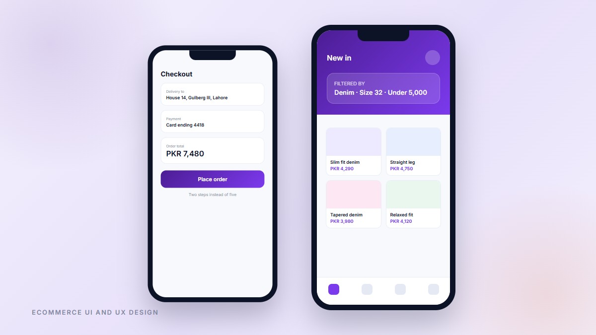
User Centred UI and UX Design for eCommerce
Shoppers were filling carts and leaving at checkout, and the client assumed the problem was pricing. Session recordings said otherwise, so we redesigned the path from category page to confirmation, cutting checkout from five screens to two, making filters usable with one thumb, and showing delivery cost before the final step rather than after it. The designs were tested with real shoppers before a line of code was written.
Details
Category:
"UI UX Design"
Have any Questions? Call us Today!
+92 324 9925737

CALL US
+92 324 9925737
BRING IDEAS TO
LIFE
LET'S TALK ABOUT YOUR PROJECT
Schedule Your Appointment
We are here to help you with experts, Mon - Fri: 09.00am - 10.00 pm PKT